I like this photo because you don’t need a design degree to understand it. There is a neat paved path, carefully laid out, and then there is the route people actually take. If I were late for class, I know which one I’d choose. The pathway already lost that argument.
That shortcut has a name: a desire path. It forms when enough people repeatedly walk the same unplanned route. It can tell us something that a drawing cannot: where people want to go, and how much of a detour they are willing to accept. The Natural Navigator has more examples of these paths.
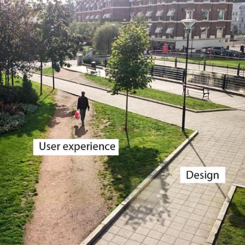
The paved route may be prettier. That doesn’t automatically make it more useful. I think this is an easy thing to forget when building something: we spend so much time looking at our own design that the way someone else uses it starts to feel obvious.
In our class, we saw a microwave used to make a similar point. It had what felt like a million buttons. There may have been a good reason for every setting, but what happens when someone just wants to warm up their food? A microwave is supposed to make that small task simple. If you need to study the controls while your lunch sits there getting cold, something has gone wrong.
This is the kind of problem we discuss in Human–Computer Interaction (HCI): how people understand and use technology. The questions also work for objects without a screen. What does this object let me do? Can I tell how to use it? Does it help me finish my task, or get in the way?
For my first assignment, I started looking at things I already use. Some were surprisingly thoughtful. Others made me ask the question in the title, usually while cleaning something, looking for a classroom, or trying to leave an app.
A toothbrush charger that became a cleaning job
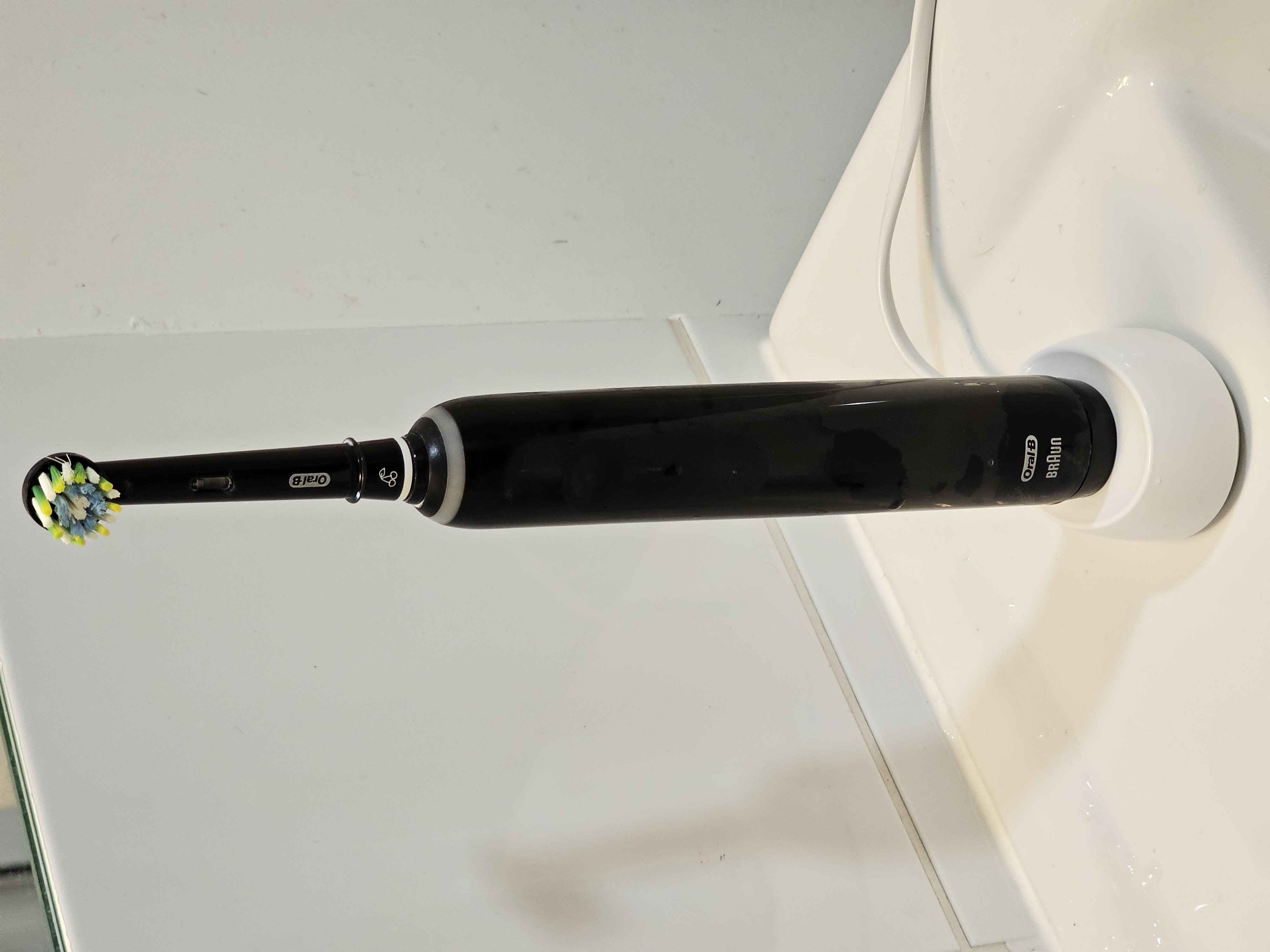
When I bought my electric toothbrush, I didn’t pay much attention to the shape of its charging base (as a normal person would do). It holds the brush upright in a little oval recess. Put the brush down, and you’re done. At least, that was what I expected.
The problem appeared through everyday use. After brushing, the toothbrush is wet, and tiny amounts of toothpaste remain on it even when I rinse it well. When I put it back on the charger, that water runs down into the recess. There is nowhere for it to drain.
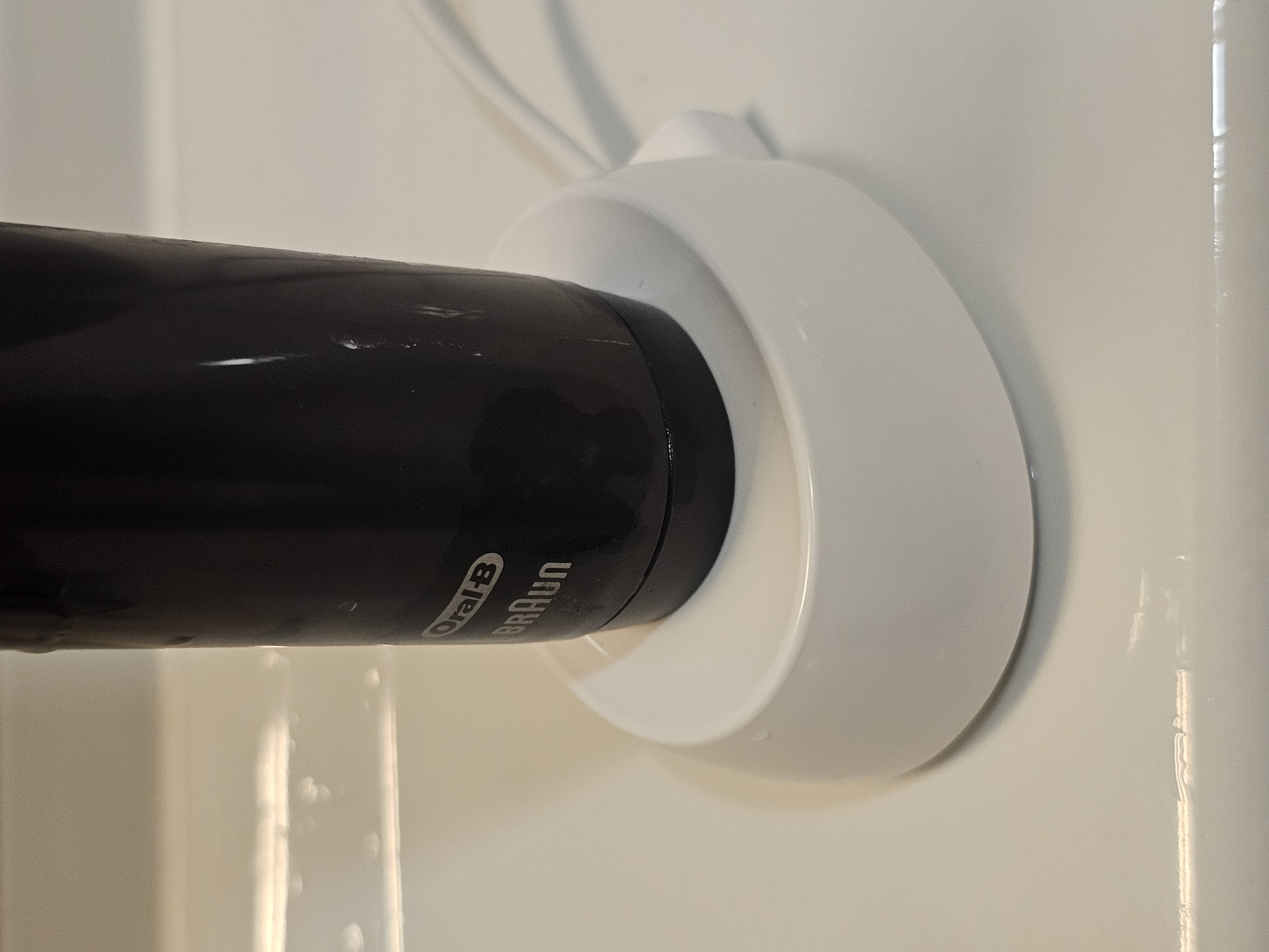
After about two weeks, I noticed a blue-green buildup at the bottom. I can’t tell from its colour what was growing there, but finding that next to something I put in my mouth was unpleasant enough. A device meant for daily hygiene had created another thing I needed to clean.
An affordance is an action an object makes possible. This base supports the toothbrush, while its fitted shape also makes it clear where to place it. The obvious routine is to leave the brush there after using it. Unfortunately, the base handles the brush’s shape better than it handles the fact that the brush is wet.
Now I only use the charger when the battery runs out. I’d rather work around it than keep scraping toothpaste out of that base. It should be redesigned so that water can drain away from the toothbrush. The design should account for the toothbrush people actually put down after brushing.
The bottle cap I expected to stay attached
Bottle caps gave me the opposite experience. In Brazil, I was used to caps that came off completely. You could lose one, mix up several on a table, or end up holding the cap in one hand while the bottle occupied the other.
Here in France, all the bottles I buy have a cap attached to the neck. It is a small change, but I like it: the cap stays with its bottle, and I don’t have to decide where to put it while drinking.
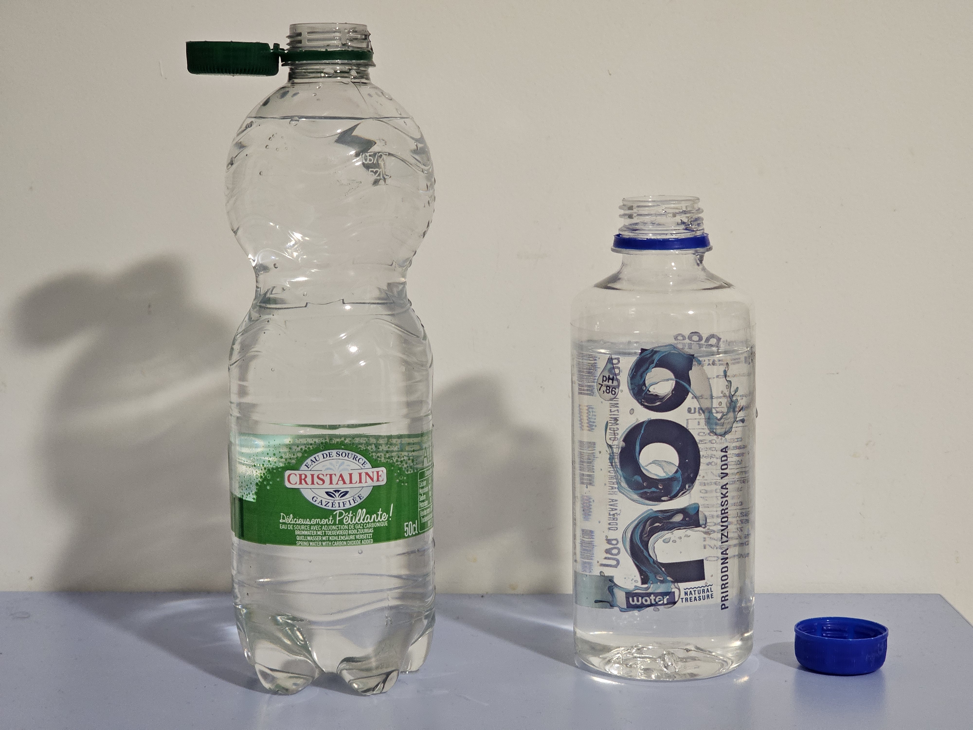
I realised how quickly I had adapted during a trip to Bosnia. I opened a bottle, let go of the cap, and watched it fall to the ground. For a moment I just looked at it, confused. I had already started expecting the cap to stay attached.
The connection changes the actions available: I can open the bottle and keep the cap with it. I understand that some people find attached caps awkward, depending on their shape. For me, this one solved a small, unknown annoyance. Good design doesn’t always announce itself; sometimes we only notice it when it is missing.
A timetable that seems to forget lunch
Design also affects what we understand before we click anything. Gestalt principles describe how we organise what we see into groups. For example, we tend to read nearby items as belonging together (proximity) and items that look alike as related (similarity).
On the Télécom SudParis student portal, I see this in the timetable. The course entries sit close together and look similar. At a glance, a day can seem to run from 10:00 to 18:00 without a break. I still remember when I first saw this while I was still in Brazil. I thought French people didn’t know what it meant to “have lunch”.
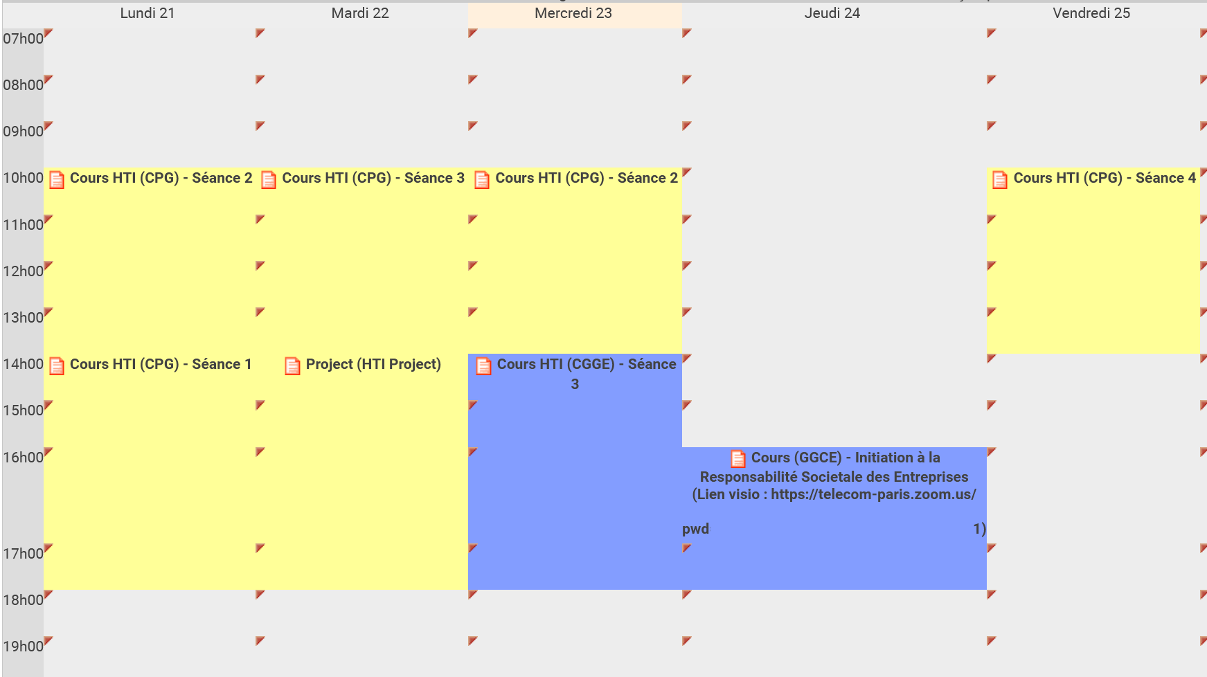
Fortunately, I found out they actually have what is called “déjeuner”. There is a lunch break from 13:15 to 14:30, but the presentation doesn’t make that interruption clear. A student who already knows the schedule can fill in the missing information. Someone opening it for the first time has to think.
Finding the classroom is another small obstacle. I have to hover over the little orange document icon beside the course name and scroll down in the details. The information is there, but it takes more effort than I would expect for a question as basic as “where do I go today?”
Design updates could include improving the visuals in general and showing the morning and afternoon as separate time blocks, with a visible gap for lunch. The room could appear under the course name. The columns for each day could use alternating shades of gray. Proximity and similarity would still help group related information, while the spacing would stop suggesting that everything is one uninterrupted session.
Two cards, two readers, no labels
Living on campus means carrying two cards: my TSP student card and my Maisel residence card. At Maisel’s entrance, there are two readers for them. The first time someone arrives, there is no clear indication of which card belongs where.
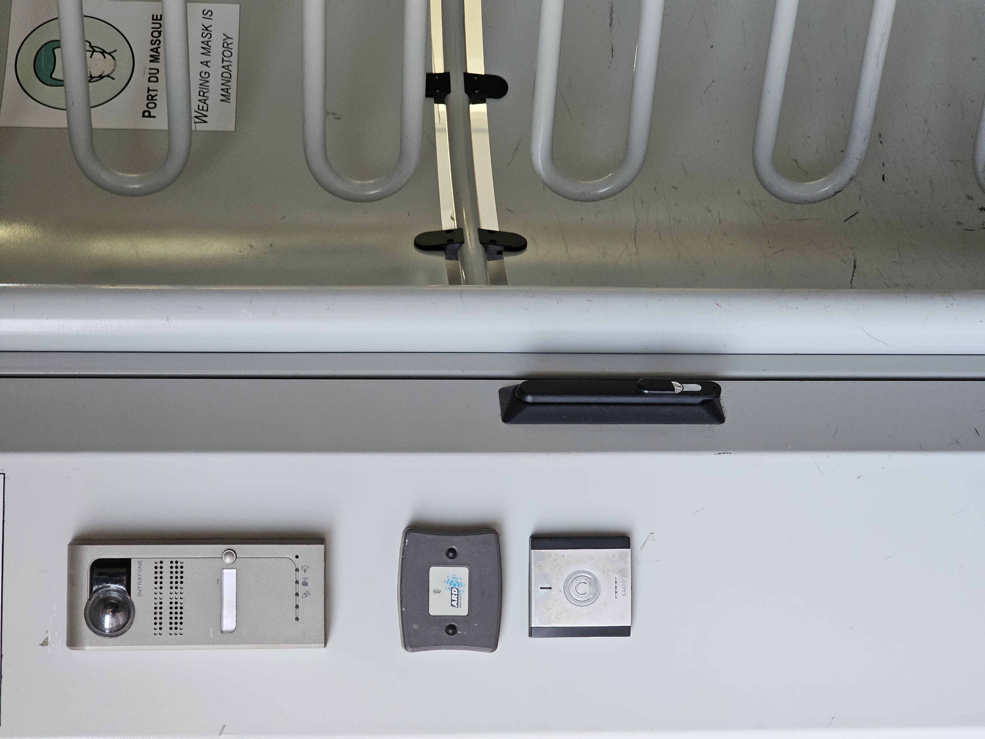
I know which card to present to each reader now. A new resident has two plausible places to try and has to learn the difference by testing them or watching someone else. You can bet that I heard a lot of “my card seems to not be working” when we had just arrived.
Strictly speaking, the main problem here is missing signifiers—clues that explain where or how to act—and an unclear relationship between the cards and their readers. When you present the wrong card, the reader still tries to validate access. The request gets denied, so it looks like the card has a problem. Gestalt’s principle of similarity suggests a useful improvement: give each card and its corresponding reader a matching symbol or image, so the pair is easier to recognise. The reader could also use a signal other than “red” to indicate that the wrong card was presented.
Google Drive: when the free trial ends, where do the files go?
The next two examples raise a different question: whose goal is the design serving? A dark pattern is a design choice that steers people towards an outcome that benefits the service, often by making another choice harder to see or take.
I recently ran into this with Google Drive. A student offer gave me extra storage for a year. I got comfortable with it and started keeping important files there. It always kept reminding me “you still have 950 GB available to use”, and unfortunately… I did fall for it.
When the offer ended, my account returned to its free storage limit, and my Google Drive usage was way over it. I ran into restrictions on editing files and warnings about what would happen to my most important Gmail account:
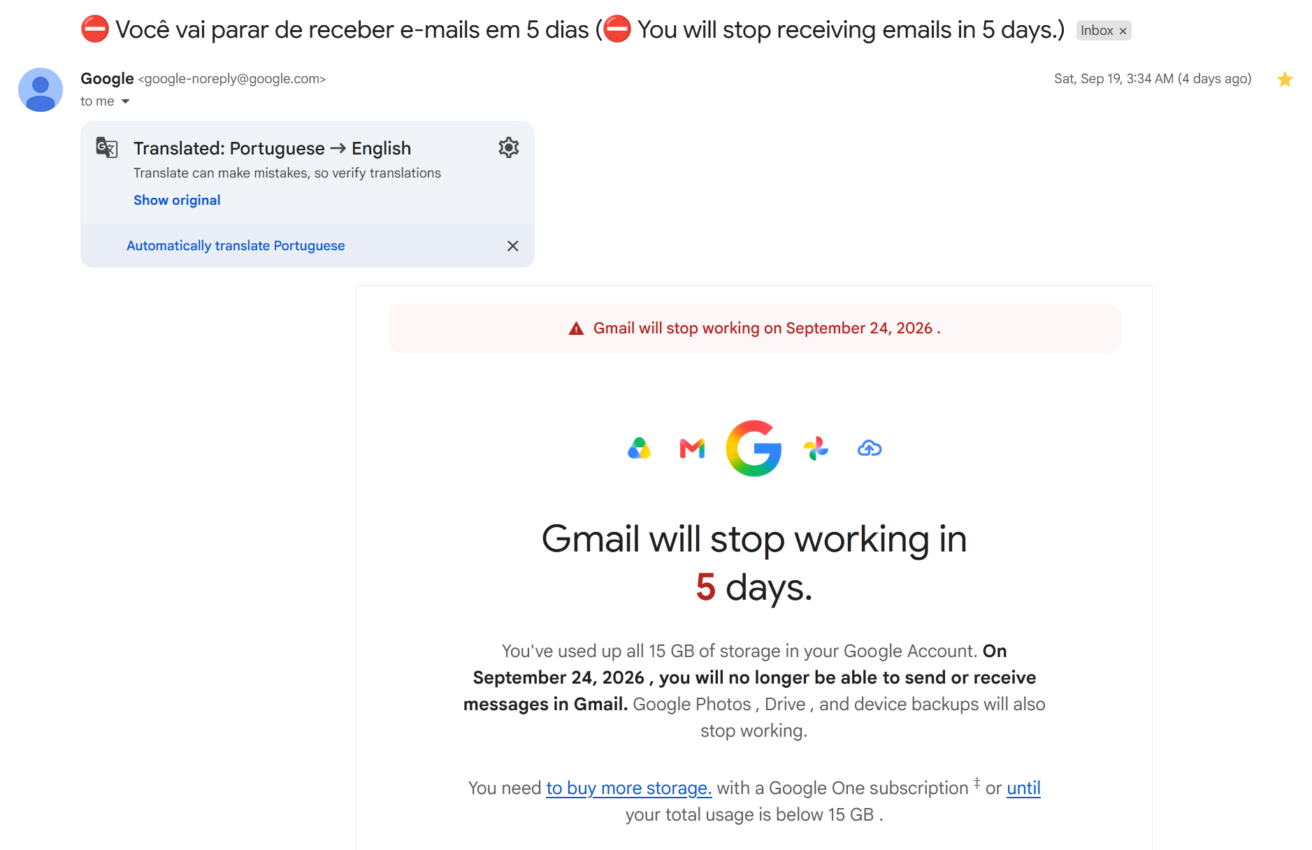
By that point, leaving the paid storage behind meant sorting through documents I had spent a year collecting. The easiest answer was to buy more storage. I eventually spent a few hours moving documents elsewhere and downloading others to get my usage down.
The limit itself doesn’t make this a dark pattern. Google explains that storage is shared across Drive, Gmail, and Photos, and that going over quota can restrict those services. It also offers ways to free space. Google’s storage help page explains the limits and cleanup options.
My concern is the pressure created when a warning about my main email account sits next to an upgrade suggestion. Paying becomes the quick way to stop worrying; clearing space takes time.
Instagram: there is always another post
Infinite scrolling is probably the example I recognise most easily. On Instagram, there is no final page to reach. Another post appears as I move down, and another follows it. I don’t have to decide to load a new page, so there is one less moment to ask whether I want to continue.
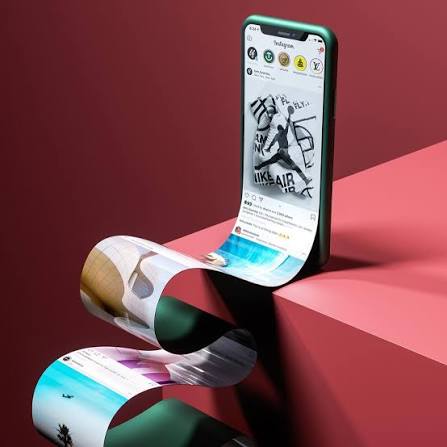
Short videos make that especially tempting. Each one asks for very little time. The total is harder to notice. I can open an app for a short break and stay much longer than I intended, without ever making one big decision to spend that time there, time I would rather spend doing something else.
Infinite scrolling can make browsing convenient. The problem is using that convenience to keep someone engaged after their original reason for opening the app has disappeared. The business benefits from more attention, while the user has to fight against the algorithm to find their own stopping point.
This concern has also reached the courts. A 2023 lawsuit by a coalition of US states alleged that Meta used features including infinite scrolling to keep young people engaged. In August 2026, the New York Attorney General announced a proposed settlement worth at least $12.1 billion, potentially rising to $17.1 billion.
What I will pay more attention to
I started this assignment looking for examples to photograph. I ended up noticing how often I adapt to a design: using the charger less, learning a reader’s position, or checking information the timetable could have shown me directly.
As an engineering student, that’s something I want to remember when I build my own projects. Getting a feature to work is satisfying. Watching someone else try to use it and completely break my expectations may tell me something my code never will.
Written for Homework 1 of my Human–Computer Interaction course at Télécom SudParis.
Cover image: original image supplied for this post.